

5 powodów porzucania koszyków w Twoim sklepie i 5 rozwiązań, by temu zaradzić
Czy kiedykolwiek robiłeś zakupy online i dodałeś przedmioty do koszyka, tylko po to, by…
Czytaj więcej

31 maja 2022

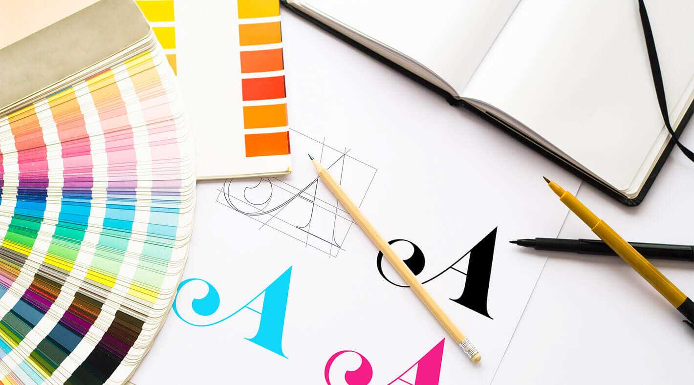
Identyfikacja wizualna, czyli to, co w Twojej firmie jest widoczne na pierwszy rzut oka, ma niebagatelne znaczenie w kontekście wyników sprzedażowych. W końcu pierwsze wrażenie robi się tylko raz…
Chcesz coli? Co przyszło Ci do głowy po przeczytaniu tego pytania? Czerwona puszka, lub butelka z napisem, który jest rozpoznawany w najbardziej odległych zakątkach świata. To jest właśnie potęga dobrze zaprojektowanego logotypu, która sprawia, że każdy wie o co chodzi. Logo to znak graficzny, zaś logotyp to tekstowe przedstawienie marki. Obie te formy mają za zadanie wywołać emocję, uczucie lub skojarzenie, które powinny pasować do Twojej firmy.
Procent Klientów przyznających w czasie współpracy, że ich logo wymaga jednak modyfikacji:
Pamiętaj, że Klient spotykając Cię po raz pierwszy widzi właśnie to.
Logo. Szyld nad sklepem. Baner na stronie internetowej. Zdjęcie profilowe na facebooku.
Dobre logo ma sprawić, że Twoja marka będzie rozpoznawalna. Takim markom Klienci ufają – co więcej, są skłonni wydać na nią o wiele więcej pieniędzy.
W zalewie treści i obrazów Twoi klienci są coraz bardziej pogubieni. Twórcy reklam prześcigają się w pomysłach na to, jak zabłysnąć, co nierzadko prowadzi do mniejszych lub większych katastrof wizualnych.
Tekst.
Tęczowy.
Brokatowy.
Tęczowo-brokatowy-z-poświatą.
Tęczowo-brokatowy-z poświatą-na-wystrzałowym-tle.
Większe logo 😉
To może jeszcze z lustrzanym odbiciem. Znasz to?
Sztuką jest zachować swój własny styl, który na wszelkich platformach komunikacji charakteryzuje się przede wszystkim SPÓJNOŚCIĄ. Chodzi o to, żeby ustalić pewien kodeks graficzny, który będzie nie do ruszenia. Kształt czcionki, starannie dobrany odcień tła, rodzaj używanych zdjęć. Księga graficzna, która stanie się swoistą biblią Twojej komunikacji z Klientem. Wszelkie elementy graficzne, oprócz spójności muszą charakteryzować się bezbłędną trafnością, zgodną z profilem firmy. Tu nie ma miejsca na niedomówienia. Mniej często znaczy więcej.
Jeżeli to wszystko wydaje Ci się skomplikowane, z pomocą przychodzą…specjaliści. Przeciętny grafik spędził lata na obcowaniu z kolorami, poznał tysiące czcionek, a także ćwiczył rękę i oko ucząc się rysunku i malarstwa. Dzięki temu najlepsi są w stanie momentalnie dostrzec szczegóły, o których laikowi się nie śniło. Mają po prostu wyczucie stylu, kompozycji, koloru…widzą „to coś” co sprawia, że jedną firmę się zapamiętuje, a drugą nie.
Możesz nawet nie zdawać sobie sprawy z tego, że Twoi Klienci patrząc na logo firmy czują emocje zupełnie przeciwne do tych, których byś sobie życzył. Najdroższe, luksusowe ubrania świetnej jakości mogą być błędnie postrzegane przez pryzmat „taniego”, niechlujnego logo. Z kolei marka, która powinna być maksymalnie przyjazna i przystępna niepotrzebnie chowa się za znakiem, który jest zimny i oficjalny. To błędy, które Twoją firmę kosztują więcej, niż myślisz.
Rozwiązania, które są darmowe, albo najtańsze na rynku mogą okazać się niewystarczające. Mało tego, paradoksalnie zwiększą koszty Twojej firmy. Jak to działa? Jeżeli zatrudnisz aspirującego studenta, syna jednego z pracowników, który naprędce zrobi Ci logo i projekty wizytówek, być może zaoszczędzisz na tym trochę pieniędzy. Po czasie jednak zwykle okazuje się, że zarówno logo, jak i projekt są do zmiany. Wtedy nie dość, że ponosisz kolejne koszty, to jeszcze zmuszony jesteś przeprowadzić brandingową rewolucję. Markę i jej rozpoznawalność buduje się praktycznie od nowa, co zabiera czas, a więc i pieniądze.

Dlatego inwestowanie w element, jakim jest System Identyfikacji Wizualnej powinno być wysoko na Twojej liście priorytetów. Pozwól zadziałać specjalistom z branży, dzięki którym komunikacja wizualna Twojej firmy będzie nie tylko atrakcyjna, ale przede wszystkim skuteczna! Logo, czcionka, a nawet firmowe kolory mogą być siłą napędową Twojego biznesu ale i przeszkodą na drodze do sukcesu. Profesjonalny audyt powinien być pierwszym krokiem, dzięki któremu zobaczysz kierunek dalszych działań. Daj się wyręczyć tam, gdzie ryzykujesz własny czas i pieniądze, na których ulokowanie masz przecież inne pomysły.
5 powodów porzucania koszyków w Twoim sklepie i 5 rozwiązań, by temu zaradzić
Czy kiedykolwiek robiłeś zakupy online i dodałeś przedmioty do koszyka, tylko po to, by…

Akcje świąteczne, które zwiększą sprzedaż w Twoim e-commerce
Okres Świąt Bożego Narodzenia to wyjątkowy czas w roku, w którym odczuwamy szczególnie magiczną…

10 błędów Black Friday, które rujnują Twój biznes
Black Friday to nie tylko wyjątkowa okazja dla konsumentów, ale również wyzwanie dla właścicieli…